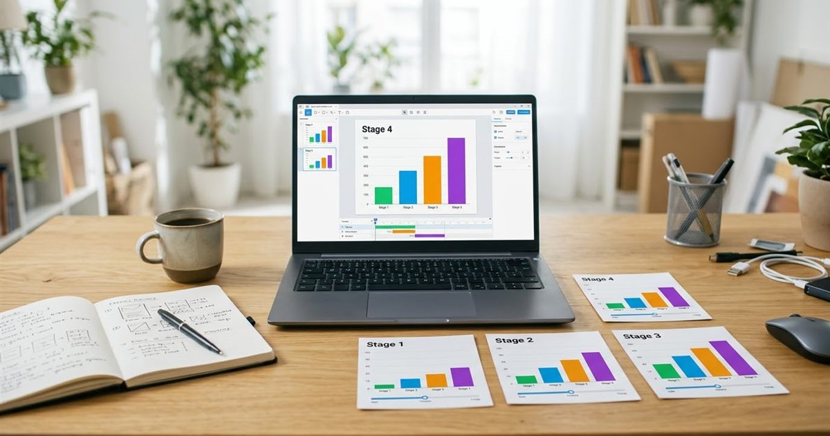
A chart tells you where things stand. An animated chart shows how they got there. Bars that grow year by year, a line that extends month by month, a map that fills in region by region: movement makes a trend easy to follow and far more likely to be remembered. You do not need data visualization software with animation features to get that effect. If you can export or screenshot a chart at each stage, the free GIF Maker turns the stages into a looping animation you can drop into a report, a presentation or a social post. This guide explains how to plan the frames, build the GIF and keep the numbers readable.
Turn your chart screenshots into an animated GIF
Open the GIF Maker, FreeWhen an Animated Chart Beats a Static One
Not every chart needs to move. A static chart is best when the reader needs to compare exact values. An animated chart is best when the story is change: growth, decline, catching up, a before and after. It pulls the eye to the part that matters, and it lets a short post carry a whole timeline.
- Growth over time, such as sales, subscribers or website visits by month.
- A race between two or three items, such as a comparison of products or teams.
- Progress toward a goal, such as a fundraising bar that fills up.
- A build up, where each frame adds one more element to explain a complex chart step by step.
If you only want to compare a before and an after, a two frame animation is enough. See before and after GIF maker for two photos for that format.
Plan the Frames Before You Capture Anything
The quality of the GIF is decided before you open the GIF Maker. Decide how many stages you need and what changes between them.
- Choose six to twelve frames. Fewer feels choppy, and many more makes the file heavy without helping the story.
- Fix the axes. If the scale changes from frame to frame, the bars seem to jump for the wrong reason. Set the same minimum and maximum for every frame.
- Keep the title, the colors and the layout identical. Only the data should change.
- Add a visible label for each stage, such as the year or the month, in a corner of the chart.
- Make the last frame the one that carries the conclusion, with a short headline.
You can create the frames in a spreadsheet, a slide deck or any chart tool. In a spreadsheet, filter the data to one period, capture the chart, then add the next period and capture again.
Capture Every Frame at the Same Size
The GIF Maker places the images in order, so all frames should have the same dimensions. If one screenshot is a few pixels bigger than the others, the edges will shift between frames.
- Set the chart to a fixed size, or capture a fixed rectangular area of the screen each time.
- Capture at a size close to the final width. A width of 800 to 1000 pixels is plenty for most uses.
- Save the images in order with names that sort correctly, such as 01, 02, 03 and so on.
- Check that no mouse pointer or tooltip appears in any frame.
If your frames come from a screen recording rather than separate screenshots, you can use the Video to GIF tool instead, as explained in how to turn a screen recording into a GIF.
Build the Animated Chart GIF
- Open the GIF Maker and drop in your frames. It needs at least two images.
- Look at the numbered thumbnails. The numbers are the playback order. Remove and re-add any frame that is out of place.
- Set the frames per second. At 1 FPS each frame lasts one second, a comfortable pace for reading a label and watching a bar grow.
- Choose the width. 700 to 900 pixels keeps text readable and the file reasonable.
- Pick the loop. Infinite works for a post or a banner. Once works if the story ends with a conclusion.
- Create the GIF, preview it and download it.
To make the conclusion stay longer, add the final frame two or three times. Each copy counts as another frame, so the last stage stays on screen for as many seconds as you repeat it.
Keep Chart Text Readable
Charts are mostly text and thin lines, and GIFs reduce colors to a limited palette. Small details can blur if you are not careful.
- Use large fonts for labels, values and the title. If you can read them at half size, they will be readable in the GIF.
- Pick flat, high contrast colors. Gradients and shadows turn into banding in a GIF.
- Avoid very thin lines. Make them slightly thicker than usual.
- Keep the background plain white or a solid color.
For the reasons behind blurry output, read why a GIF looks blurry or pixelated. For sizes, see GIF resolution and dimensions.
Where to Use an Animated Chart GIF
- In a slide deck, where a looping chart replaces several static slides. See GIFs in slideshows and presentations.
- On social media, where motion helps a data post stand out. Check size limits for X and LinkedIn first.
- In a report or an internal dashboard page, as a quick visual summary.
- In a blog article, to illustrate the main finding.
In email, some programs show only the first frame, so make the first chart readable on its own. If you plan to place the GIF on a website, add alt text that states the main finding in words. GIF SEO, alt text and file names has examples.
Common Mistakes to Avoid
- Changing the axis scale between frames, which makes the data look wrong.
- Using too many frames, which creates a heavy file with little benefit.
- Letting the animation loop with no pause on the final result.
- Hiding the key number in tiny text.
- Forgetting that some viewers need a text description of the result.
If the final file is too large, how to reduce GIF file size walks through the fixes.
Frequently Asked Questions
How do I animate a chart without special software?
Capture the chart at each stage as an image, then combine those images into a GIF with a free GIF maker. You only need the same size and a fixed axis for every frame.
How many frames should an animated chart GIF have?
Six to twelve frames work for most charts. That is enough to show a trend without making the file heavy.
Why do the bars jump in my animated chart?
The axis scale probably changed between frames. Set the same minimum and maximum for every frame so only the data moves.
Can I use an animated chart GIF in a presentation?
Yes. Most slide programs play GIFs automatically in slideshow mode. Make the first frame readable in case the animation does not play.
Ready to animate your chart?
Open the GIF Maker, Free